With the election season coming down to the wire, the World Series upon us and Taken 2 finally in theaters, it would take something completely momentous and utterly enthralling to draw your attention elsewhere. The Mayan prophecy? Nope. The discovery of intelligent extraterrestrial life? Huh-uh. How about a primer on the costs and benefits of polystyrene as a building material? Yep.
For more, see my latest post on the FXFOWLE blog, "Goodnight, Styrene?" It's part of a month-long look at the life cycles of building materials. Hold on to your seats.
Showing posts with label Analysis. Show all posts
Showing posts with label Analysis. Show all posts
Wednesday, October 24, 2012


Sunday, July 22, 2012
In Praise of Light and Shadow: The Bloch Building at the Nelson-Atkins
Such is our way of thinking—we find beauty not in the thing itself but in the patterns of shadows, the light and the darkness, that one thing against another creates.

5 years after it opened, I finally made it to the Bloch Building at the Nelson-Atkins Museum with my dad (while back in Kansas City for the All Star Game). The last time I was there, it was still under construction, and Maura, Wade and I were shooed off of the roofscape by an irritated security guard. This time, I was able to appreciate the Steven Holl-designed tour-de-force in totality. With the possible exception of the beautiful siting and procession through the landscape and around the buildings, the outstanding attribute of the Bloch is its treatment of light. Since the 5 buildings of the Bloch are referred to as "lenses" (by Holl) or as "lanterns" (by everybody else), this makes sense. The sculpting of daylight is most obvious within the museum, where the ceiling and walls have been carved and curved away from the clerestories. But it's also being done on the exterior surfaces, such as in the pronounced board formwork of the site cast concrete retaining walls leading down to Rockhill Road along the east edge of the site, the shadows of which accentuate the lines of the landscape.
And in the slight kinking of the channel glass facade, which creates a subtle contrast between surfaces of the lanterns, and between the lanterns and the hues of the sky.
The embankments of the landscape rise to envelope the museum below, so the lenses are not actually separate buildings, but portions of the building rising above the landscaped roof to create clerestories and atria bathed in soft, natural light.
An aerial view helps to clarify what's going on:
A clean system of channel glass and stainless steel fittings and trim enhances the perception of the buildings as massive geometric objects emerging from the ground.
Visitors enter at the North end, which is largely above ground. The atrium is washed in a soft, bright daylight filtering through an innovative wall system developed with Heintges (curtain wall consultants). Bendheim Glass fabricated a custom 16" wide double-skin channel glass module infilled with Okapane, a translucent light-diffusing insulating material composed of acrylic tubes. The rhythm of the three-story glass wall is traversed by a cascading staircase leading from the upper lobby to administrative spaces above (I believe).
Against the brightness of the atrium, the adjoining galleries and the entrance to the original building stand in stark contrast. The sequence modulates from light to dark and shades between, leading to stunning moments such as below, where the ceiling peels away to capture the sunlight once more.
At certain points, the translucent veil is lifted--at the entrance, at the connection to the sculpture garden. Instead of creating an atmospheric glow or a subdued dimness, the design selectively frames a focal point without.
Even the parking garage, that most utilitarian of structures, cannot escape the penetrating gaze of the Sun. The undulating concrete roof is punctuated by circular skylights carved into the base of the reflecting pool above, giving the sunbeams a playful air as the water dances across the lens.
One of my favorite pieces in the museum's collection also happened to involve a dramatic manipulation of light and shadow: a three-dimensional mural by the Argentine-born French artist Luis Tomasello. Tomasello is known for creating the Atmosphère chromoplastique, in which white geometric objects with (oftentimes) colored backsides are arranged on a white surface, so that the resulting shadows take on the hue of the color. It's quite beautiful, and and a striking subversion of traditional notions of color and shadow.
For further exploration into Tomasello's work, process, philosophy and influences, check out this interview with the artist, helpfully posted by the Nelson Atkins. It's in French, but fear not... there are subtitles.
If you ever find yourself in Kansas City--or Wichita or Omaha or St. Louis, even--I cannot recommend highly enough a trip to the Nelson-Atkins, whether you're an art enthusiast, an archi-tourist, or both. And if you finish and feel a little too high fallutin', shift gears and treat yourself to some Gates barbecue.
UPDATE: Marc Fink from Bendheim Wall Systems (which supplied the custom Lamberts channel glass) has helpfully written to fill in the blanks regarding the rest of the design/construction team for glass at the Bloch:
Managing Architect: BNIM
General Contractor: JE Dunn
Glaziers: Carter Glass
Structural Engineer: Kelley Gipple
- Junihiro Tanazaki, In Praise of Shadows

5 years after it opened, I finally made it to the Bloch Building at the Nelson-Atkins Museum with my dad (while back in Kansas City for the All Star Game). The last time I was there, it was still under construction, and Maura, Wade and I were shooed off of the roofscape by an irritated security guard. This time, I was able to appreciate the Steven Holl-designed tour-de-force in totality. With the possible exception of the beautiful siting and procession through the landscape and around the buildings, the outstanding attribute of the Bloch is its treatment of light. Since the 5 buildings of the Bloch are referred to as "lenses" (by Holl) or as "lanterns" (by everybody else), this makes sense. The sculpting of daylight is most obvious within the museum, where the ceiling and walls have been carved and curved away from the clerestories. But it's also being done on the exterior surfaces, such as in the pronounced board formwork of the site cast concrete retaining walls leading down to Rockhill Road along the east edge of the site, the shadows of which accentuate the lines of the landscape.
 |
| View of Bloch Building along Rockhill Road |
And in the slight kinking of the channel glass facade, which creates a subtle contrast between surfaces of the lanterns, and between the lanterns and the hues of the sky.
 |
| The Bloch Building in relation to the original museum, as seen from the South |
The embankments of the landscape rise to envelope the museum below, so the lenses are not actually separate buildings, but portions of the building rising above the landscaped roof to create clerestories and atria bathed in soft, natural light.
 |
| View of the Bloch Building from the North. The original museum is to the right and behind the camera, and the sculpture garden is down the hill to the right. |
An aerial view helps to clarify what's going on:
 |
| Aerial view from West (courtesy of Google Maps) |
 |
| One of the lanterns embedded into the landscaped roof, along with coping and base details |
Visitors enter at the North end, which is largely above ground. The atrium is washed in a soft, bright daylight filtering through an innovative wall system developed with Heintges (curtain wall consultants). Bendheim Glass fabricated a custom 16" wide double-skin channel glass module infilled with Okapane, a translucent light-diffusing insulating material composed of acrylic tubes. The rhythm of the three-story glass wall is traversed by a cascading staircase leading from the upper lobby to administrative spaces above (I believe).
 |
| Main Atrium of the Bloch Building |
Against the brightness of the atrium, the adjoining galleries and the entrance to the original building stand in stark contrast. The sequence modulates from light to dark and shades between, leading to stunning moments such as below, where the ceiling peels away to capture the sunlight once more.
 |
| Clerestories formed by "cutting away" the landscape from the building |
At certain points, the translucent veil is lifted--at the entrance, at the connection to the sculpture garden. Instead of creating an atmospheric glow or a subdued dimness, the design selectively frames a focal point without.
 |
| Connection from Bloch Building to sculpture garden. Sculptures by Isamu Noguchi can be seen in the foreground. |
Even the parking garage, that most utilitarian of structures, cannot escape the penetrating gaze of the Sun. The undulating concrete roof is punctuated by circular skylights carved into the base of the reflecting pool above, giving the sunbeams a playful air as the water dances across the lens.
 |
| Parking garage, beneath the reflecting pool |
One of my favorite pieces in the museum's collection also happened to involve a dramatic manipulation of light and shadow: a three-dimensional mural by the Argentine-born French artist Luis Tomasello. Tomasello is known for creating the Atmosphère chromoplastique, in which white geometric objects with (oftentimes) colored backsides are arranged on a white surface, so that the resulting shadows take on the hue of the color. It's quite beautiful, and and a striking subversion of traditional notions of color and shadow.
 |
| Luis Tomasello, "Chromoplastic Mural" |
For further exploration into Tomasello's work, process, philosophy and influences, check out this interview with the artist, helpfully posted by the Nelson Atkins. It's in French, but fear not... there are subtitles.
If you ever find yourself in Kansas City--or Wichita or Omaha or St. Louis, even--I cannot recommend highly enough a trip to the Nelson-Atkins, whether you're an art enthusiast, an archi-tourist, or both. And if you finish and feel a little too high fallutin', shift gears and treat yourself to some Gates barbecue.
UPDATE: Marc Fink from Bendheim Wall Systems (which supplied the custom Lamberts channel glass) has helpfully written to fill in the blanks regarding the rest of the design/construction team for glass at the Bloch:
Managing Architect: BNIM
General Contractor: JE Dunn
Glaziers: Carter Glass
Structural Engineer: Kelley Gipple
Saturday, October 30, 2010
Topography: Evolution of Lower Manhattan
Site Model examining the evolution of Lower Manhattan: an artifact created during the site analysis stage of a project for Celia Liu's High Line studio at UWM (2003). The layers of the model explore the superimposition of the rigid Manhattan street grid (represented by the white plastic eggcrate) over the topography of the island, pre-European settlement (white museum board). Above the grid, I created another layer representing the subway system. While still confined to the strictures of the grid, as most subway access points obviously correspond to heavily trafficked intersections, the subway lines reinstate more fluid and organic paths of movement over (or under, as it were) the rationalized grid.
Materials: Foam core and museum board base, plastic eggcrate louver, strap-ties, nuts, bolts, washers and reclaimed wires.
With a little more time, I might look into how other systems fit into the model (underground aquifers, sewage, etc.). In the meantime, check out The Welikia Project (an extension of the Mannahatta Project) and a diagram of Manhattan's changing shoreline over the course of the past 400 years.
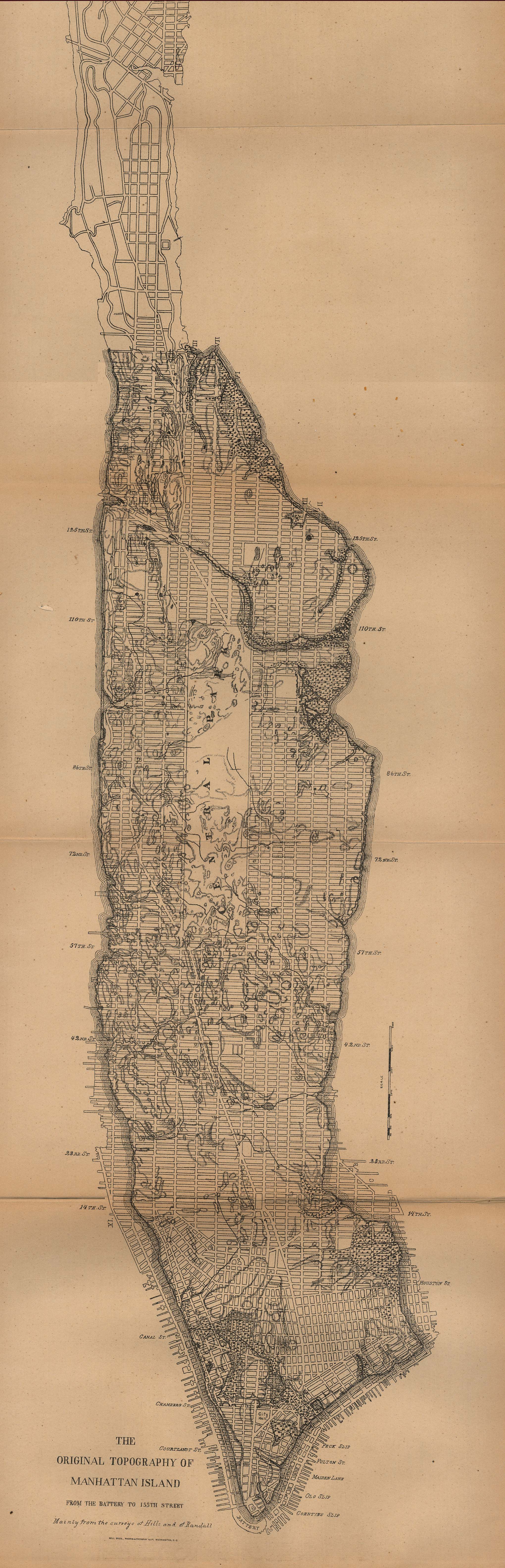
UPDATE: this map from 1880 is quite interesting. It shows the street grid at the time with the original topography overlaid.
 |
| Site Model: Overview |
 |
| Site Model: Detail |
 |
| Site Model: Details |
Materials: Foam core and museum board base, plastic eggcrate louver, strap-ties, nuts, bolts, washers and reclaimed wires.
With a little more time, I might look into how other systems fit into the model (underground aquifers, sewage, etc.). In the meantime, check out The Welikia Project (an extension of the Mannahatta Project) and a diagram of Manhattan's changing shoreline over the course of the past 400 years.
UPDATE: this map from 1880 is quite interesting. It shows the street grid at the time with the original topography overlaid.
Friday, September 10, 2010
Pass the Corbusier (or Architectural Analysis 002: Villa Savoye vs. Villa La Roche)
Comparative Analysis of two houses designed by Le Corbusier--Villa Savoye (in Poissy) and Villa La Roche (in Paris). Axonometric and plan drawings reproduced from literature from Le Centre des Monuments Nationaux and the Le Corbusier Foundation. Sketches and photos are mine, as are the really high-tech red overlays.
Completed in the Spring of 2005 for the SARUP Florence-Paris program with Professor Kyle Talbott.
 |
Initial Documentation
|
 |
Central Ordering Devices
|
 |
Fluidity and Dynamism
|
 |
Relationship to Exterior
|
Completed in the Spring of 2005 for the SARUP Florence-Paris program with Professor Kyle Talbott.
Friday, September 3, 2010
Walking with Haussmann's Ghost (or Urban Space Analysis 002: Parc Citroën vs. Parc de la Villette)
Comparative Analysis of two modern Parisian parks. Site plans reproduced from park literature. Sketches and photos are mine.
And as a little carrot... evidently you've gotta get up to get down. One of the many reasons I love Parc Citroën:
UPDATE: Apparently the editors at Project for Public Spaces (PPS) don't know a good thing when it smacks them in the face. Thankfully the readers dropped the knowledge in the comments section.
Completed in the Spring of 2005 for the SARUP Florence-Paris program with Professor Kyle Talbott.
 |
Paris (Satellite Photo via Google Maps)
|
 |
| Initial Documentation |
 |
| Ordering Systems |
 |
| Crossing Paths/Vertical Connectors |
 |
| Integration of Urban Context |
And as a little carrot... evidently you've gotta get up to get down. One of the many reasons I love Parc Citroën:
 |
| Parc Citroën Cross Section |
UPDATE: Apparently the editors at Project for Public Spaces (PPS) don't know a good thing when it smacks them in the face. Thankfully the readers dropped the knowledge in the comments section.
Completed in the Spring of 2005 for the SARUP Florence-Paris program with Professor Kyle Talbott.
Wednesday, September 1, 2010
The Church of What's Happening Now (or Architectural Analysis 001: Santo Spirito vs. Amiens)
The first in a series--this time, it's architectural: a rudimentary comparative analysis of the Church of Santo Spirito (in Florence) and Amiens Cathedral (in Amiens, France). For those of you on the edge of your seat after this nailbiter, further exploration of Amiens will follow at a later date.
 |
Initial Documentation
|
 |
Materials, Order and Delineation |
Sunday, August 29, 2010
Spoken into the Void: Adolf Loos and the Search for Truth
Art, which made the floor under the ancient's foot and the vault of the church ceiling over the Christian's head, is now cramped onto boxes and bracelets. The times are worse than one thinks.The outspoken critic of ornamentation, who nevertheless could not quite live up to his own ideal. Adolf Loos: the declared foe of the Viennese Secession and the German Werkbund. Pevsner’s “enigma.” While his texts, when taken as individual essays, are chock-full of inherent contradictions, Janet Stewart contends that the complexities and contradictions of Loos’ texts are a reflection of the modern age of which he saw himself a part. She sees “a ‘new’ Loos, simultaneously ‘modern’ and ‘traditional,’ whose sense of paradox identifies him as a sensitive barometer of the tensions characteristic of Viennese modernity” (9).
- Goethe
The evolution of culture is synonymous with the removal of ornamentation from objects of everyday use.
- Adolf Loos, "Ornament and Crime" (1908)
Wednesday, August 25, 2010
Pi-Yahtzee! (or Urban Space Analysis 001: Santa Maria Novella vs. Santo Spirito)
Dear Loyal Readers (all 4 of you),
Today marks the first in what I hope to be a continuing series of explorations of successful urban spaces. To get things going, I'll start by reaching back into the vault to grab a few analyses--gasp--I've already done. Future posts might be a little more blog-friendly. As it were, the initial analyses were documented somewhat on the fly during my '05 semester abroad. Exhibit A: a comparative analysis of two piazzi in Florence--Piazza S. Maria Novella and Piazza S. Spirito.
For reference, a site plan of central Florence, with the two areas under consideration highlighted:
Today marks the first in what I hope to be a continuing series of explorations of successful urban spaces. To get things going, I'll start by reaching back into the vault to grab a few analyses--gasp--I've already done. Future posts might be a little more blog-friendly. As it were, the initial analyses were documented somewhat on the fly during my '05 semester abroad. Exhibit A: a comparative analysis of two piazzi in Florence--Piazza S. Maria Novella and Piazza S. Spirito.
For reference, a site plan of central Florence, with the two areas under consideration highlighted:
 |
Florence (Satellite Photo via Google Maps)
|
 |
S. Maria Novella: Initial Documentation
|
 |
S. Spirito: Initial Documentation |
Subscribe to:
Posts (Atom)